We talk about our graphic designers a lot. They’re great. We love how our graphic design team can take a business’s vision and create a logo that perfectly reflects their values as well as their products and services.
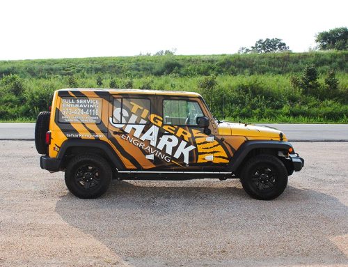
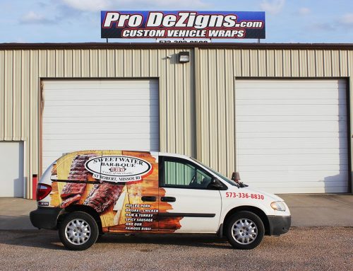
At Pro DeZigns, we think it’s important to build your business’s image through multiple visuals such as vehicle branding, building signs such as a glass storefront, and promotional items such as hats and koozies that fit your brand.
What else would you put on your visuals besides your logo?
While we have a whole team dedicated to helping our clients, we think it’s important you know what goes into our design process. All of these elements work together to communicate with potential customers.
Size:
How big your logo is will determine its end shape and possibly where it can be used. Think, do you need multiple sizes of a logo to stay adaptable?
Color:
There is power in color. Each color says something a little different and makes viewers feel a certain way.
Uniqueness:
You want to stand out from your competitors (in a good way.) Your logo must scream your business so you can be instantly recognizable. It’s common to draw inspiration from other businesses, even those outside your industry, as long as your logo ends up screaming your name.
Adaptability:
Where will your logo be going? On a website, the side of a truck, maybe on a pamphlet? It’s important that your logo is able to be used with any medium.
Typography:
Like color, font choice carries a lot of weight. Not only will your font affect the readability and adaptability of your logo, but it may have an even larger impact on how potential customers feel about your brand.
Before any of the above are selected, in-depth research is conducted on the individual business through an intake session and industry trends. Research is a vital part of the design process, which influences every other choice.


